UX/UI Failures - Home Page (Part 2)
A well-structured home page, that shares information in a logical format and incorporates social proof, will resonate with both Google and your audience.
WEBSITEDESIGNUXUX/UIUIHOME PAGE
Bill Arnold
11/22/20235 min read
The home page of a website is often the first point of contact for users. It sets the tone and establishes the initial impression of your brand or business. The layout of content on a home page is a critical factor in capturing the attention of visitors and driving conversions.
Module 5 - Areas of Specializations
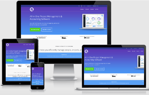
If your website visitor has scrolled down to module 5, congratulations. They are generally interested in your business offerings, so it is time to provide a deeper context. For most companies, this will mean either product or industry segments that they serve.
Showcasing the industries your products serve on your home page, helps you connect with your ideal customers and buyer personas. When they scroll down and see that they are one of the industries you cater to, you effectively communicate your expertise and specialization in those industries. This demonstrates to the visitors that you understand the unique challenges and needs of your customers, positioning you as a valuable partner rather than just a vendor. Ultimately, this approach allows you to tailor your messaging and marketing efforts toward your ideal customers, resulting in more targeted and effective communication.
This module provides a scannable snippet that links to an interior page (see part one). The interior page should then have an in-depth discussion that shares your expertise in that industry.


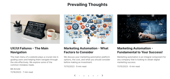
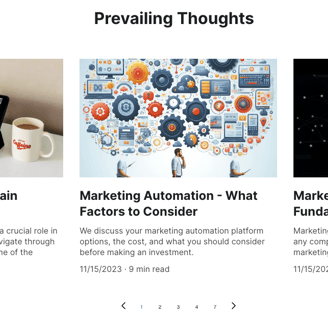
Module 6 - Blog Summary
One of the biggest UI/UX failures that many companies make is not having a module on their home page that contains a summary of their most recent blogs. This provides a scannable preview of the content, enticing the reader to click through and read the full articles. There are a number of reasons for this being a best practice that should be incorporated by all organizations who want to ensure their website attracts, engages, and converts visitors. These include:
Enhanced SEO - Google and other search engines reward fresh original content. For many companies, their home page remains stagnant. Having a recap of your most recent blogs ensures that you always have fresh original content on your most visited web page. If you are not blogging enough to generate content for this module, start! See our recent article called "Blogging Your Way to Growth" for all the reasons you need to be blogging.
Engagement - It allows visitors to easily see and access your most up-to-date content without having to navigate through multiple pages. This can greatly enhance user experience and convenience, as they can quickly find the information they are looking for.
Relevance - Showcasing your recent blogs on the home page can help to keep your website fresh and engaging. It gives the impression that your site is active and regularly updated, which can attract more visitors and encourage them to explore further.
Module 7 - Satisfied Clients
For all the same reasons you included third-party recognitions and awards in Module 1 - Verification of Trust and testimonials in Module 4 - Testimonials, you need to have a module on your home page that showcases prior clients who have utilized your services.
By doing so, you leverage social proof by providing evidence that others have had positive experiences with the product or service being offered. It utilizes several principles from “Influence: The Power of Persuasion” by Dr. Robert B. Cialdini. Specifically, the Law of Social Proof, the Law of Authority, and the Law of Liking.
This module not only instills trust and credibility in potential customers but also acts as a testimonial to the quality of your services. By displaying satisfied clients, you are creating a sense of assurance and reliability in your business. This module serves as a visual representation of the positive experiences and outcomes your previous clients have had. It allows visitors to your website to see real-life examples of the value and effectiveness of your services. Additionally, this feature encourages potential customers to engage with your business and inquire further about the services you offer. By highlighting your past clients, you establish a strong foundation of trust and enhance your reputation, ultimately attracting more potential customers.


Module 8 - Call To Action
Having a call to action (CTA) at the bottom of your website's home page is considered a best practice, because it eliminates friction. By removing friction, you are creating a seamless and effortless experience that eliminates any obstacles that could hinder or prevent potential customers from interacting with your brand.
Placing the CTA at the bottom also ensures that users have had the opportunity to thoroughly explore the content and understand your unique value proposition. Now, you are simply providing them the next step they need to take to derive the benefits of your product or services.
Footer
The purpose of a footer on a website is to assist visitors by providing critical information and navigational information. Your footer should include:
Contact Information - Most website visitors understand that if they are looking for your company's contact information, it will be in the footer. Be sure to include a phone number, physical address, and email address. Be sure to link this information to a Google Analytics account or a marketing automation platform (e.g. Hubspot), so you can track how many people click on the phone number or email to contact you.
Newsletter/Blog Signup - If a website visitor made it all the way to your footer, it is safe to assume they found some of the content interesting. Take advantage of this interest, by asking them to sign up for your blog or newsletter.
Sitemap - To improve your SEO and user experience, include in the footer a plain and simple HTML sitemap. If visitors to your website are unable to find what they’re looking for using your site, they will be able to locate it in your HTML sitemap.
Copyright, Privacy Policy & Terms of Use - To protect your intellectual property be certain to have a copyright sign with the current year in the footer. In addition to protecting yourself from liability, conforming with governmental laws, and keeping clients informed, have a link in the footer to your privacy policy and terms of use. Copyright information ensures that the website's content is protected and not misused. A privacy policy and terms of use are crucial in informing users about how their personal data is collected and used, as well as the terms and conditions they agree to when using the website
Company Logo - Be certain to add, to your site’s footer, your company logo.
Social Media Icons - The footer is where you want to place your social media icons, (not in the header). Make sure you link them to all your social platforms.
Pro tip - Ensure that when the visitors click the icons, a new window opens so as not to divert traffic off of your website. Depending on what type of content management system you are using, you can also add a real-time social media posting feed.
Conclusion
We did provide some hard and fast rules and best practices. However, a lot of how your website will be designed, and the content it contains, will be predicated by your industry and what your buyer personas need to see. If you have an eCommerce site, the guidance we outlined does not apply to you. We will have a future blog describing best practices for eCommerce UX/UI.
Contact:
prevailer@prevail.marketing
(424) 484-9955