UX/UI Failures - Homepage (Part 1)
The importance of user experience (UX) and user interface (UI) on the home page of a website cannot be overstated. The home page serves as the virtual front door to a website, and it is crucial to make a positive first impression.
WEBSITE DESIGNWEBSITEDESIGNUXUIUX/UIHOME PAGE
Bill Arnold
11/21/20235 min read
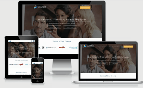
The importance of user experience (UX) and user interface (UI) on the home page of a website cannot be overstated. The home page serves as the virtual front door to a website, and it is crucial to make a positive first impression. UX focuses on creating a seamless and intuitive browsing experience for users, ensuring that they can easily navigate and find the information they need. UI, on the other hand, deals with the visual elements and design of the website, including the layout, colors, and typography.
A well-designed home page, with a user-friendly interface, can enhance user engagement, increase conversion rates, and, ultimately, drive business growth. Without a strong UX/UI, visitors may face difficulties in navigating the website, leading to frustration and a high bounce rate. Therefore, investing time and effort into optimizing the UX/UI of the home page is essential for a successful online presence.
While there are no firm and fast rules as to how the sequence of content should be laid out on the home page of a website, we have discovered, through years of A/B testing, that the flow of information can greatly impact the user experience and conversions.
Often, the type of business and the availability of content will dictate what can be put on a home page.
We will showcase the information and sequence of modules that have proven highly effective for our rCommerce B2B clients. Remember that each module on your home page should have an h2 tag that describes what they will find in that section and, most importantly, how it will benefit them.
Module 1 - Verification of Trust
When a visitor first comes to your website, they first want to know if you can help them address their problems and concerns. They should find the answer to these questions in the header and main navigation.
The next question that immediately pops up is "Do you do good work?" and "Can I trust you?" These questions need to be answered before they can focus on how you will help them. The first module after the header should be a verification of trust module.
Prospective clients will believe what seemingly independent third parties have to say about your company more than what you say about yourself. This module should recognize those independent organizations that have rated you or awards that showcase your good work.
If you have achieved recognition from third-party referral sites (e.g. Capterra, G2Crowd, Software Advice), show the badges you have earned.


If third-party referral site recognition is not available, substitute accreditations from a recognized business partner or awards you have won.


Module 2 - Business Services/Products
Now that you established your value proposition and generated some trust, the visitor is willing to begin understanding more about your product and service offerings.
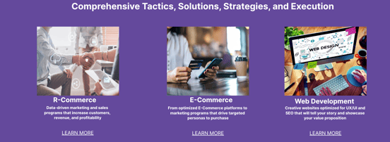
The best practice for doing so is to provide a snippet of each product or service and have it linked to an interior page for more information. There are two reasons for this approach. The first is to have high-value internal links for SEO. The second reason is for the page to be scannable.
A website needs to be scannable by visitors, before they are ready to dive deeply into the content. It allows users to quickly gather information and navigate efficiently through the website. Scannability refers to the ability of visitors to skim and scan through the webpage, identifying key elements and relevant information. With the increasing amount of content available online, users have become more impatient and tend to skim through websites rather than reading every word. By making a website scannable, with clear headings, bullet points, and concise paragraphs, visitors can easily identify the important information they are looking for. According to Nielsen Norman Group, a leading user experience research firm, users typically spend only 10-20 seconds on a webpage before deciding whether to stay or leave. Therefore, optimizing a website for scannability is crucial to engage and retain visitors.

Module 3 - Explainer Module
In the third module, we recommend giving the visitor context as to why you are the best choice or something that makes you unique. Consider this the spot to explain why they should choose you over your competitors. This is an ideal place to use an explainer video.
An explainer video is a short video that aims to explain a concept, product, service, or process in a clear and concise manner. It typically uses animation or motion graphics combined with a script to engage and educate viewers. Including an explainer video, on the home page of your website, can be highly beneficial for several reasons:
It helps to grab the attention of visitors and quickly communicate the value proposition of your business.
It also helps to simplify complex ideas and make them more easily understandable for your target audience.
It can increase user engagement, time on site, and conversion rates, as it has been shown to hold viewers' attention for longer periods of time compared to plain text.
When visitors see positive reviews and feedback from satisfied clients, they are more likely to feel confident in making a purchase or engaging with the company. Testimonials also showcase the value and quality of the offerings, highlighting the benefits customers have gained. By prominently displaying testimonials on the home page, businesses can create a positive first impression and establish a sense of reliability. Moreover, testimonials can differentiate a website from competitors and influence customer decision-making. In summary, testimonials play a crucial role in building trust, boosting credibility, and converting visitors into loyal customers.
Module 4 - Testimonials
We strongly believe the next module should be testimonials from former clients. We positioned it in the fourth module to reinforce that the visitor is making the right decision with engaging your website.
Testimonials on the home page of a website are highly beneficial, as they help build trust and credibility among potential customers. These testimonials serve as social proof, providing evidence that others have had positive experiences with the product or service being offered. It utilizes several principles from “Influence: The Power of Persuasion” by Dr. Robert B. Cialdini. Specifically, the Law of Social Proof, the Law of Authority, and the Law of Liking.
There are many ways a business can display customer testimonials — and. when determining the best approach for your business, it's important to keep in mind that different formats and mediums can have varying effects on your target audience. You'll want to use a format that's viewable for your potential leads and aligns closely with their values.
Testimonials that include either a picture or a video of the client are proven to be more effective than those that are without. In addition, one-sentence testimonials are often viewed to be superficial and do not transfer the trust that is sought.
There should be a minimum of three and ideally five testimonials. Influencer marketing is a critical component that is relied upon by prospective clients. People, by nature, are skeptical creatures, so you need to overcome their concerns and convince them to contact your office.
A good testimonial has the following attributes:
Discusses the benefits of the product
Substantiates your product claims
It is from someone your audience can relate
Is credible
Is curated by market segments
Come back for Part 2 of our discussion on UX/UI - Home Page.
Contact:
prevailer@prevail.marketing
(424) 484-9955
