UX/UI Failures - The Main Navigation
The main menu of a website plays a crucial role in guiding users and helping them navigate through the site effectively. We explore some of the common mistakes made.
WEBSITE DESIGNWEBSITEDESIGNUXUIMAIN NAVIGATION
Bill Arnold
11/19/20237 min read
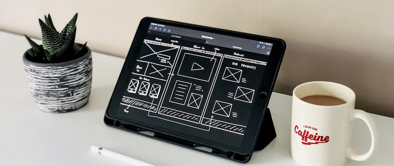

A website is the epicenter of all your marketing efforts. It contains all the reasons that a person should do business with you. The internet is filled with articles about how to design a website, so that it will engage and convert a visitor. Yet, all too often, we see the same mistakes being made by companies who should know better.
Today, we are going to share our collective pet peeves and frustrations on how too many companies are crippling their efforts by often foolish mistakes.
What is UI/UX?
Social Media Placement
UX refers to the USER EXPERIENCE, and UI refers to the USER INTERFACE. The two need to be optimized, so that the overall experience ensures that the visitor can easily find the information as they interact with a website. When you design a webpage that’s centered on UX/UI, you create a space that’s easy for the reader to access, understand, and navigate. Some concepts that involve a user’s experience include:
Why Does UI/UX Matter?
The process they go through to discover your company’s unique value proposition
The determination if a process or procedure is applicable to them
The sequence of actions they take as they interact with the interface
The thoughts that arise as they try to accomplish their task
The impressions they take away from the interaction as a whole
Consider the following facts:
More than 65% of people prefer to read a UX-optimized site over a plain webpage.
In the same study, nearly 40% of people exit websites that load slowly.
Doing something as simple as incorporating a more popular color can boost your revenue.
It’s essential to make your site responsive. The amount of mobile traffic grows every year and is expected to be half of global connections in 2020.
It is obvious that a website that is optimized for UX/UI will present an enjoyable experience for the web visitor, allowing them to find what they are looking for, and will result in them staying on the site longer. Small details, such as the font, wording, and graphics, are all visually compelling and create a cohesive interface that will attract users and increase traffic.
UX/UI is also important for obtaining organic traffic. Google algorithms will reward sites that allow the visitors to easily find what they are looking for and where navigation is intuitive. UX/UI is comprised of many items, including:
Navigation
Home Page Structure
Home Page Content
Load Speed
Internal Linking
External Linking
SEO
There is no question that having a social media presence is important no matter if you are a B2C or B2B company. We are huge proponents of omnichannel marketing. However, the purpose of ALL your social activity should be to create interest, awareness, and backlinks to your website.
You spend a lot of time, talent, and expense trying to drive traffic to your website. Having your social media icons in your header is simply inviting the visitor to leave as soon as they arrived.


The proper location, to place your social media icons, is in the footer. By the time the visitor finds their way to the footer, they have been given every opportunity to learn about your value proposition.
The ONLY time it is appropriate to place the social icons in the header is when the client is a social influencer and they derive their income from people engaging them on those social platforms.
Main Navigation
The main navigation of a website plays a crucial role in guiding users and helping them navigate through the site effectively. It should offer an intuitive logic that is predictable to the user. We often find the navigation to be confusing or fail to follow best practices. Here are some of the issues we typically find:
Be Intuitive: Unless you are already a well-known brand, or have a particular reason to be avant-garde, stick to normal protocols when setting up your main navigation. It is more important that the visitor can seamlessly find what they are looking for than have a clever layout that is confusing.
The typical layout for the main navigation is to have the logo - navigation links - CTA. This has become the normal layout that everyone understands. It was established because most cultures in Europe and the Americas read from left to right. In doing this, the visitor will first see your website (logo), their options (navigation links), and finally the call-to-action.
We are big at Prevail Marketing in implementing psychological strategies in all marketing endeavors, and this includes the layout of the main navigation. The principle that covers this is the serial position effect.
This principle states that a person is likely to remember the first and last items in a series better than those in the middle.
Be Concise: It is important that the navigation links not be cluttered but reflect the most important categories of information. The ideal number of links is four to five with the maximum being seven.
There are two reasons for limiting the number of navigational links to a maximum of seven. The first is simply to avoid clutter. There is only so much available space in the navigation bar, and having too many links will make it hard to read. The second reason is the paradox of choice. If there are too many options, it can decrease user satisfaction, and create anxiety, or indecision. You want the user to feel good about visiting your website, so avoid anything that might disrupt their experience.
If you have properly developed the buyer personas for your company, you will know what categories are the most important and should be listed.
PRO TIP: Do not waste a navigational link on a "HOME" button. It is universally understood that clicking on the company logo will bring you back to the home page.
When we started this blog, we quickly learned that we are a rather picky group, and by the time we put together our list, we could have easily had enough material for an eBook. However, we decided it was easier (and better SEO) to break this topic up over several blog posts. Today, we will focus on the main navigation.
We will be addressing each of these topics in a series of blogs.
Be Informative: If the categories do not provide enough delineation, the website should have a mega menu. Mega menus offer some advantages for UX/IU and SEO. The main purpose of any menu is to perform the following:
Tells you where you currently are on the website.
Allows you to find the information that is most pertinent to your concerns or problems.
A mega menu is an expandable menu that offers many choices displayed in a two-dimensional dropdown layout. They are an excellent design choice for accommodating many options or for revealing lower-level site pages at a glance. Mega menus have the following characteristics:
Big, two-dimensional panels divided into groups of navigation options
Navigation choices are structured through layout, typography, and (sometimes) icons
Everything is visible at once — no scrolling
Vertical or horizontal form factors when activated from top navigation bars
When activated from left-hand navigation, they might appear as mega fly-outs (not shown)
Menu options revealed on hover, click, or tap


Be Sticky: The main navigation bar is critical to the user experience by allowing them to find where to find the information they are seeking. A sticky main navigation bar refers to a website design element that remains fixed at the top of the page, even as the user scrolls down.
A sticky menu enhances the user experience by providing constant access to key navigation options, eliminating the need for users to scroll back to the top of the page to access the menu. This saves time and effort, improving overall usability.
A sticky navigation bar improves website navigation and increases user engagement. By keeping the navigation always visible, it encourages users to explore more pages and interact with the website's content.
Be Helpful: A call-to-action (CTA) in the main navigation of a website is essential because it increases conversion rates by directing the users toward the desired action, such as making a purchase or signing up for a demo. By placing the CTA strategically placed in the top right corner, it will be noticed as we read from left to right.
If you use a sticky navigation, the CTA will ALWAYS be available when they are ready to engage.
Be Responsive: Desktop computers make up only 40.16% of the total website traffic. Mobile devices make up 57.8%, and the balance is on a tablet (Mobiloud). It is, therefore, critical that the website be of a responsive design. This means building a website that adapts and adjusts its layout and content based on the screen size and device used by the viewer. In other words, it ensures that the website looks and functions seamlessly across various devices, such as desktop computers, tablets, and mobile phones.
We bring this up under the navigation section, because a website navigation bar does not work on a mobile device. Instead, use a hamburger menu, which is depicted by three stacked lines, on mobile devices. This common icon is universally understood.
Be Accessible: The text and the colors used in the main navigation bar need to be optimized for readability. Make sure that the color contrast and font size are easily legible on both desktop and mobile devices. While color is often the default method of showing where you are at, we recommend using additional visual cues, such as underlining, for those who are colorblind.
Conclusion
One of the most common website design failures is poor navigation. Users should be able to easily find what they are looking for on your website without having to spend too much time or effort. If your navigation is confusing, cluttered, or difficult to use, visitors may become frustrated and leave your site.
To avoid this design failure, follow the guidelines we discussed.
Contact:
prevailer@prevail.marketing
(424) 484-9955