UX/UI Failures - The Header
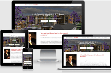
The header is one of the most important features on your website, as the ratio between the space it takes and the benefits it gives is unparalleled. In fact, we contend that the header is the most valuable real estate on the entire website. It must attract and compel the visitor to act.
HEADERWEBSITEDESIGNUXUX/UIWEBSITE DESIGNUI
Bill Arnold
11/20/20235 min read


The home page of a website plays a crucial role in creating a positive user experience (UX) and user interface (UI). It is often the first impression visitors have of a website, and it determines whether they will stay and explore further or leave immediately. Therefore, it is essential to implement the best UX/UI practices to ensure that your website's home page is engaging, user-friendly, and visually appealing. In this blog, we will explore some of the top UX/UI mistakes that we often see and offer insights that can help you create an effective home page for your website.
Header
Normally, the logo and top navigation are considered part of the header. However, we already discussed these in our blog entitled: UX/UI Failures - The Main Navigation. For purposes of this blog, we are referring to the header as the top module of the website.
The header is one of the most important features on your website, as the ratio between the space it takes and the benefits it gives, is unparalleled. In fact, we contend that the header is the most valuable real estate on the entire website. It must attract and compel the visitor to act. Most visitors will not navigate any further into the website unless the header:
Captures their attention
Confirms through messaging and imagery that the website can address their concerns and problems.
This means that it is incumbent on the web development team to understand the buyer personas. If the website does not have contextual attributes (e.g. messaging and imagery that morph and change based on the identified buyer persona) that message and image must resonate with ALL targeted buyer personas. We are going to discuss some "do's and don'ts" when it comes to your header image.
Will increase the load time of the webpage, which can lead to a poor user experience, and have a negative SEO impact.
Distract visitors from the main content of the website, as they continuously change and shift focus. This can make it harder for users to find the information they are looking for and result in lower engagement.
Is not mobile-friendly and can cause compatibility issues on different devices.
Impact the website's SEO, as search engines prioritize content that is easily accessible and relevant.
Sliders - Web developers often try and solve the problem of different buyer personas by using sliders that can be manually or automatically rotated. While this may sound like an elegant solution, by having a unique message and image on each slide, it is a mistake. Using a slider in the header:
There are two better options than using a slider in the header. The best solution is to build a contextualized website that morph's once the buyer persona is known because of where they originated or their activity on the website. This can be an expensive resolution but will pay dividends once built.
The second alternative is to provide a dual path in the header. Here is an example from Facade Access where the header is split between those prospects seeking consulting and those seeking scaffold inspections/testing.


Bold Statement of Purpose - The very first message that any visitor is likely to see on your website is the h1 tag in a website header. This message is critical because you have mere seconds to make the initial connection with the website visitor.
It takes about 50 milliseconds (that’s 0.05 seconds) for users to form an opinion about your website that determines whether they like your site or not and whether they’ll stay or leave (Sweor).
It takes 2.6 seconds for a user’s eyes to land on the area of a website that most influences their first impression (Sweor).
Within five seconds you must answer the following questions:
What is this site about?
Can it address my pain points and concerns?
Does it interest me enough to scroll down or click a link?
If you are lucky enough to get a positive reaction from the visitor, you bought yourself another 15 seconds of their interest. This is why the h1 tag needs to identify the main topic or subject of the content. Best practices for using the h1 tag include using only one h1 tag per webpage, ensuring that the h1 tag is descriptive and accurately represents the content of the page, and using relevant keywords in the h1 tag to improve search engine optimization. Additionally, it is important to style the h1 tag appropriately, ensuring it stands out visually without overshadowing other content on the page. Overall, the h1 tag plays a vital role in both guiding users and search engines in understanding the content and structure of a webpage.
The h2 tag and the imagery of the header need to support and add context to the h1 tag.
The error that too many people make is they try to get "cute" with the h1 tag and do not make any attempt at sharing their value proposition. Unless you are Apple, you need to assume that your website visitors do not know or care who you are when they first arrive. Having a quirky statement, or simply saying, "Let's Talk," will lose you visitors and business.
Call to Action - It is amazing the number of websites that simply do not have ANY CTA in their header. In fact, 70% of small business websites lack a CTA on their homepage. Users want to know what your website wants them to do. They may not always do it, but you absolutely have no chance if you do not have a CTA. Since about 80% of your visitors will not scroll down the page, it is wise to have a CTA in the header.
Secondary CTA - About 96% of visitors who come to your website are first-time visitors who are not ready to buy and will NOT click on a bottom-of-the-funnel CTA, or make an appointment for a demo (Inc. Magazine). They are simply trying to determine if you can answer their questions, solve their problems, or see whether they can trust you.
The reality is, that they may investigate dozens of different alternatives before they are ready to make a call or set an appointment. It is important, during this first visit, that you entice them to let you know who they are, so you can follow up with a lead nurturing campaign. That is why you need a secondary CTA.
The secondary CTA also needs to be in the header and offer the visitor the opportunity to download a piece of content that is highly relevant and informative in exchange for their email address.
The website header holds significant importance, as it serves as the first point of contact for users visiting a website. It not only grabs their attention, but also helps them navigate effortlessly through the site. A well-designed header can provide a clear and concise representation of the website's purpose, branding, and overall identity. A well-optimized header can enhance the user experience by ensuring easy access to crucial elements and creating a sense of familiarity. By incorporating a visually appealing and user-friendly header, websites can make a lasting first impression, maintain user engagement, and ultimately improve conversions.
Conclusion
Contact:
prevailer@prevail.marketing
(424) 484-9955